In its original World War I-era naval context, dazzle camouflage was not meant to conceal. Rather, the intersecting geometric patterns make it difficult to estimate a ship’s range, speed and direction of travel — a clue to the disorientating experience of Tilson’s work. With figures flashing in and out of view in shifting landscapes, the viewer must find her own direction. The ambiguity ‘allows for people to read into it as they want to,’ she says.
Share this article
Razzle Dazzle ‘Em
Hannah Tilson’s work hides in plain sight. Tartans, plaids and tattersalls chequer works on paper. Folds of fabric enclose sometimes barely discernible figures who peer out from palimpsestic canvases. Even napkins, hand fans and suits are covered as her patterns escape the frame. Tilson takes her lead from razzle dazzle, ‘a kind of camouflage,’ created via ‘the deliberate arrangement of contrasting patterns next to each other,’ the artist explains. ‘I like the idea of really busy shapes vibrating next to each other.’

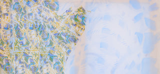
Hannah Tilson, Lonely City, 2023, mixed media, 100 x 65cm
"I like the idea of really busy shapes vibrating next to each other"

Hannah Tilson, Hectic form of forgetting. Image courtesy of Peter Otto
In Lonely City, for instance, ‘It’s quite hard to see that there's a figure there, and if I hadn't outlined the figure with the lino, you probably wouldn't notice that there were knees at the bottom and an arm coming down and hair at the top,’ Tilson says. Instead, the viewer might first be drawn to the intricate pattern in the top left, the way it meets the larger, gauzy blue area like the coastline on a map. The canvas’ scale (100 x 65 cm) and its crossed wooden beams, visible through the layers of mixed media, recall an average UK window, and this basic structure conspires with slabs of white to suggest light passing through. Yet, opposingly, the faded colour of the kneeling figure suggests something like sun-damaged wallpaper. Either way, time is passing. Sensitive to ephemera, and calling attention to its own materials, Lonely City enacts a feeling similar to the Japanese phrase mono no aware, an awareness of the transience of things. Attempting to connect with the kneeling figure, who is in any case turned away, the viewer finds pleasure in unexpected patterns and spaces and settles into the sense of alone-togetherness described by the work’s title. ‘For me,’ Tilson says, ‘Lonely City has that mixture of huzz and buzz, the busyness of the city, next to the feeling of being alone.’

Hannah Tilson, Razzle Dazzle. Image courtesy of Peter Otto and Cedric Bardawil
"Lonely City has that mixture of huzz and buzz, the busyness of the city, next to the feeling of being alone."
In Tilson’s work, it is possible to experience contrary feelings, inside and outside, all at once, unsure of your speed or direction of travel. ‘I like people having to look twice,’ Tilson says of her work’s ambiguity. Not only does she make us look twice, the sheer audacity of her patterns makes us aware of our very eyeballs, á la Bridget Riley’s op art. Sometimes the intersecting patterns are so busy they could move. In the same breath, for every tricksy work titled Zippy or Verve there are others invoking softness and which seem to covet stillness. ‘I think we live in a time when everything's so quick – everything is like, three seconds,’ Tilson says. ‘If I walk to the kitchen in my studio, which is a 20-second walk away, I bring my phone with me.’ Her method combats busyness with busyness: perversely, it makes the viewer slow down.

Hannah Tilson, Soft Cut, Installation View, image courtesy of Peter Otto and Cedric Bardawil
‘I've always been really interested in information overload,’ Tilson says. ‘When I was at the Slade I was really interested in Ed Ruscha and advertising and Americana. That earlier form of consumerism seems more tangible; it was like you could hold onto it. Whereas now, it's a three-second attention span on your phone.’ Perhaps this is why it is particularly gratifying that Tilson’s mixed media works do not translate well to the screen: Lonely City (along with The Hectic Form of Forgetting, which showed recently in her solo exhibition Soft Cut at Cedric Bardawil) wants to be seen IRL, with the light hitting its tactile layers.

Hannah Tilson, Soft Striped. Image courtesy of the artist
"Hannah Tilson’s work hides in plain sight"
Certainly, Tilson’s earlier work is chequered with Ruscha-esque racing flags, white picket fences and gasoline stations, while her more recent work reconceives this pop sensibility for the smartphone era, for those of us chasing the next hit of light emitting diodes. The philosopher Zygmunt Bauman used the metaphor ‘liquid modernity’ to describe the constant change and mobility in contemporary society, a condition characterised by multiple yet fleeting social experiences. Tilson’s metaphor is swooshing fabric.

Hannah Tilson, Vivacity, image courtesy of the artist
The meanings of Tilson’s fabric are manifold (pun intended). In works such as Swoosh, Broadway Boogie and Vivacity, sweeping fabrics (and brushstrokes) express movement, as well as the state of constant mobility living under late stage capitalism. Her textiles are tactile but untouchable (only paint!) Often, curtains partially veil Tilson’s figures. In Her Body Thrummed, the figure curls up under a canopy of fabric, like a child in a homemade den, and merges into it. If a portrait traditionally depicts a person, these contain the opposite impulse, to hide and suppress, and are all the more dramatic for it.

Hannah Tilson, Swoosh. Image courtesy of Richard Ivey
"If a portrait traditionally depicts a person, these contain the opposite impulse, to hide and suppress, and are all the more dramatic for it"
Since no-one is totally this or that, introvert or extrovert, Tilson’s portraits are all the more human in their contradiction. ‘That's a bit like the idea of hiding in plain sight – the person who appears very confident could actually be reserved,’ Tilson says. ‘Here I am with the colourful, bright outfits, the colourful, bright paintings, but then there’s Lonely City. That's a different “inside” feeling.’ Likewise, Tilson hopes her viewers ‘feel comforted by what they’re seeing, but then also, there’s something disrupting, which makes them question things.’ Does Tilson draw our attention to hide or hide to draw our attention? Though this is disruption, there is comfort in it.
By Sammi Gale
Cover image: Hannah Tilson, Lonely City, 2023, mixed media, 100 x 65cm. View work)